Blog
Jun
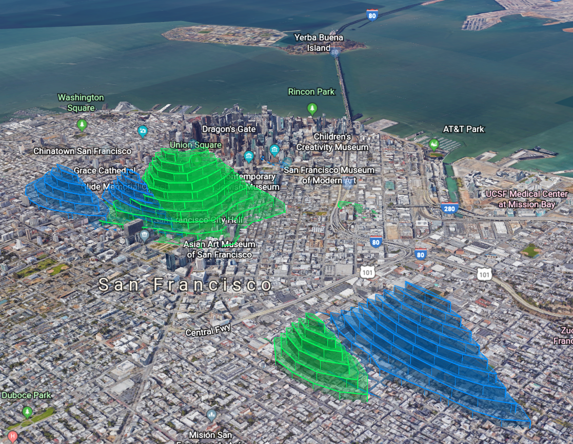
SF Police open data in Google Earth (Drugs=GREEN, Prostitution=BLUE) [OC] from dataisbeautiful
Crime is a perpetual plague on society. It always has been and it always will be. In our modern times, we continue to look for ways to minimize crime. One of the ways law enforcement does this is by focusing on trouble areas. The San Francisco Police Department wanted to know where these trouble areas are. So they collect and report data to pinpoint troubled areas.
A user on Reddit, u/SquishyData, recently put together the visualization of this crime data that you see above. He specifically focuses on where a majority of drug and prostitution arrests or incidents happen in and around San Francisco. A picture says a thousand words, and u/SquishyData wanted to see what people would say about the visualization Many Reddit users have commented, providing additional information. Let’s read what they said.
Not the Whole Picture
Data requires interpretation. For example, and as u/SteamandDream alludes to below, the data only shows locations where arrests or incidents happen. I’m sure there are dangerous neighborhoods where even the police don’t like to patrol. The crime occurrences in those areas will not show up in the data visualization picture.
Real Experiences
People who are from or have visited San Francisco can correlate their experiences with the data picture. This picture also gives tourists a great idea of what places to avoid. For example, u/normal_whiteman stated: “I’m visiting SF soon and this map is a great resource”. Hopefully, other visitors to San Francisco will also see the visualization since it would give the visitors a better chance to stay safe.
Another View
Data being open to interpretation allows for differing opinions. For example, u/pantless_pirate has replied against another comment stating that the lit up areas are where one is less likely to get arrested for drugs or prostitution. U/pantless_pirate replied “You would think, but it’s actually the opposite. The lit up areas are the areas where you are safest to partake in drugs or prostitution because those areas are the least gentrified and while the cops monitor those activities in those areas, they don’t actually ever make any arrests. If you tried to smoke crack openly near AT&T stadium you’d be picked up in a second. In the heart of the Tenderloin, the cop standing on the other corner would be making sure you stay out of traffic but otherwise let you alone.”
A Separation of Crime
Other users, like u/puppy2010, made an interesting observation which indicates drug and prostitution occurrences happen in separate areas. There’s a clear overlap in the area at the top; however, the visualization shows drug and prostitution arrests happen in different areas, even though they are mostly next to each other. U/SquishyData, the creator of the visualization, commented “I was also surprised! It’s important to also note that the records are incident reports and not all reports lead to an arrest. Maybe the police are keeping tabs on these areas and not arresting.”
Jun
The US States in Order of the Annual Income from the top % of Earners
Jason C. 0 comments Data Visualization
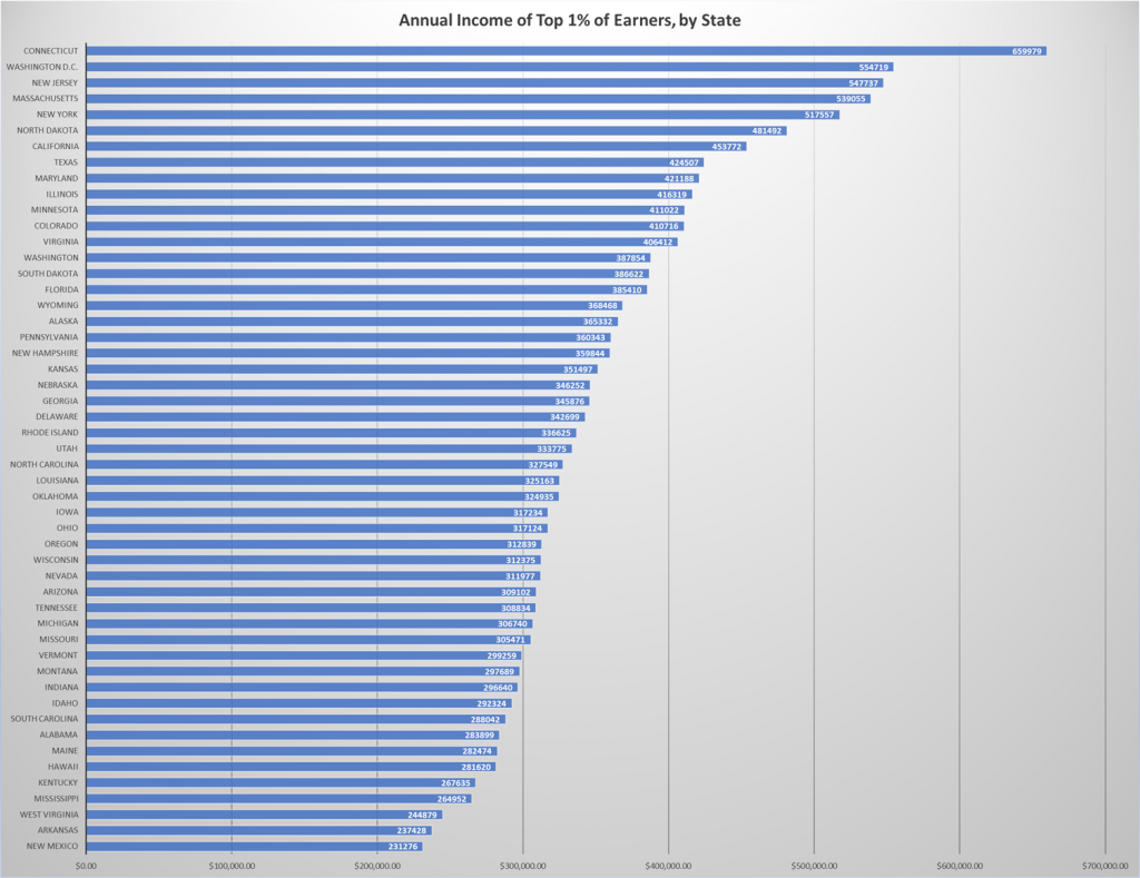
Annual Income of Top 1% of Earners, by State [OC] from dataisbeautiful
How much yearly income makes you a rich person? What is a rich person? In each state, there is a different threshold which will put you in the top 1% of earners. There’s quite a difference between Connecticut, the state with the highest 1% threshold, and New Mexico, the state with the lowest 1% threshold. In Connecticut, you need to make at least $659,979 in order to be in the top 1%. In New Mexico, you need to earn $231,273 a year.
This data comes from the Economic Policy Institute. A Reddit user, u/mynameiselderprice, recently visualized this data in the diagram shown above. U/mynameiselderprice shared the diagram picture on Reddit. Money is a touchy subject for many people. Let’s read what some people have to say about the diagram.
Interpreting the Numbers
Like all data, some information is open to interpretation. Reddit user u/orictomptive explains “the big difference for CT is mostly due to a single county, Fairfield. Fairfield is about an hour from New York City where the new-rich build mansions on the water.” U/orictomptive further write about how helicopter taxis are available in Fairfield County. Another Reddit user, u/TheManMulcayhee, confirmed a first-hand account of the wealth there. They wrote “I do field work in Fairfield County. Yesterday, a Rolls Royce and a McLaren drove by [me].”
State Number Six
North Dakota came in at number six on the list. Some Reddit users were confused as to why the state beat other states such as California and Texas. U/DonViaje summed it up nicely: “There’s been a huge oil boom in the past few years in North Dakota”. The oil industry is a powerful one and it would be no surprise to find out oil magnates live in the same state where drilling operations take place.
The rich aren’t the only ones taking advantage of oil in North Dakota. Reddit user u/Ralsten explains “I’ve been working in the ND oil field for the past 4 years now. Somebody with no college and the willingness to work hard and long hours can easily pull in $60-$80k a year so I can’t even imagine what the execs and CEOs are making.” It’s also important that a salary between $60-$80k goes further in North Dakota than in New York City or Los Angeles.
Industries at the Top
Connecticut, New Jersey, and California are all states at or near the top. What are some high-paying industries in each state? U/BenTheHokie says “Connecticut is where all the hedge funds are located.” U/ducati1011 confirms that some New Jersey residents work finance in New York City. They drive or take public transportation during the day. Then, they return to New Jersey to enjoy their higher quality of life in the form of lower housing costs. U/rabuy2000 mentions that California has a high number of “tech jobs”. All in all, the diagram is a great way to visualize what it means to be in the top 1% in each state.
Featured Photo by Vladimir Solomyani on Unsplash


