Blog

Nov
Dallas Map Startup Shows Critical Data in One Place
Jason C. 0 comments Dallas, Data Visualization, Maps
Knowledge is power! And in our Information Age, data is the new form of knowledge. This data is being used to make humanity better. Technological advances are moving at the speed of Moore’s Law which sees computer power doubling every two years.
Data can be used to improve the lives of people at the federal, state, and local levels. One of the ways to determine where data will encourage positive action is to actually see the data. This can be accomplished by creating a data visualization on a map.
For Dallas, Texas, this such data visualization has become a reality. A substantial number of data sets have been collected with the goal of making the city better. This visualization is called TheMap. D Magazine gives us some background of how the map came to be.
Improving Dallas with a Map
Robert Mundinger, a longtime resident of Dallas, noticed problems in the areas he lived in. Matt Goodman of D Magazine wanted to learn more about TheMap from Mundinger.
Matt writes, TheMap is “an open-source, interactive web portal that allows users to access an array of data sets that can help people better understand all sorts of things about Dallas. The data sets can be used to generate maps. It’s all exportable. “A kid’s educational outcome is dependent on education and crime and health and access to food, access to internet, libraries,” Mundinger says. “All these variables affect each other so much that there needs to be one place where people can look at them together and analyze them.”
What Mundinger wants to achieve in simple: Highlight at-risk areas of the city. In addition, and while he was at it, Mundinger went ahead and included more data set that might be of use.
There are neighborhoods in Dallas which have a high concentration of poverty. This is included in the map visualization. There are intersections that have more fatal pedstrian crashes than others. This is also included in TheMap. There’s even data about where there are working females over the age of 16. The information contained within TheMap is comprehensive!
Let’s take a closer look at the data sets available for viewing.
Data Sets in TheMap
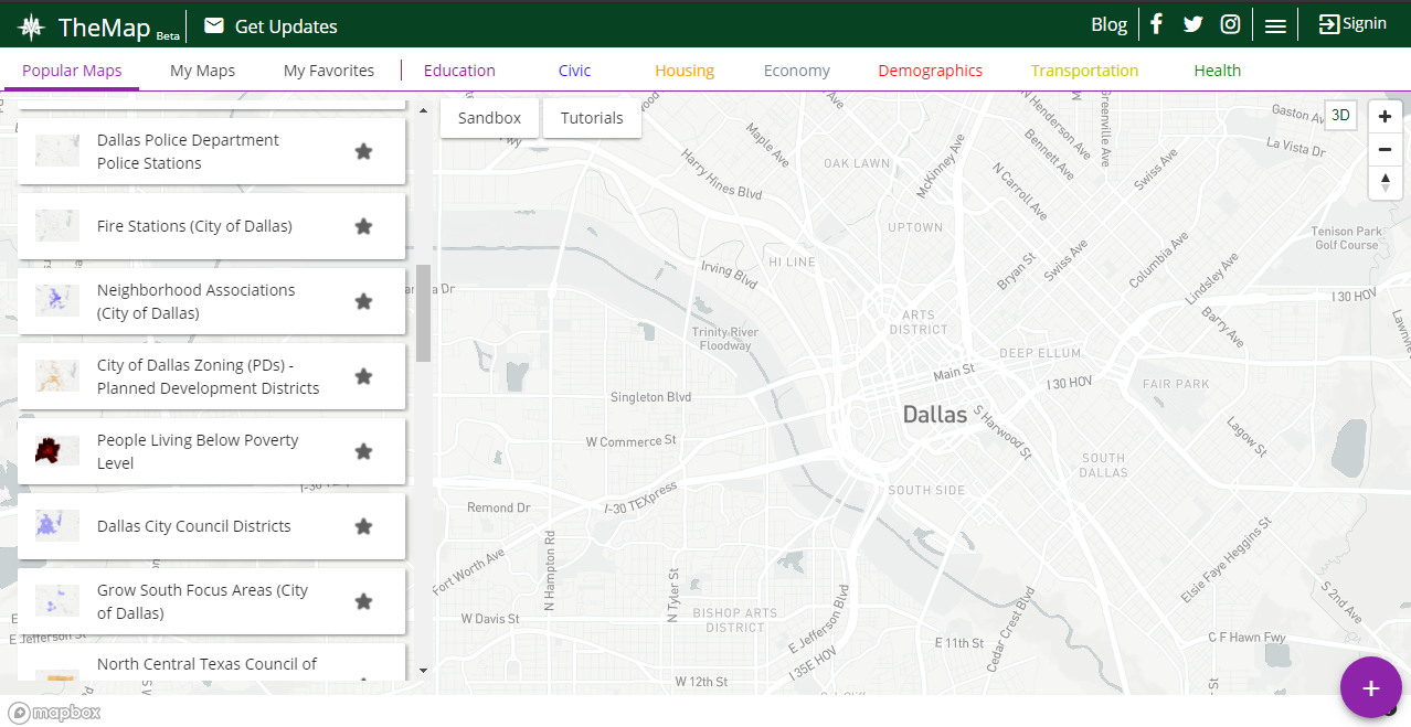
Police stations, fire stations, neighborhood associations, poverty areas—these are some of the data sets that are included in TheMap. Take a look at the column on the left to see them all. TheMap defaults to Popular Maps whe you visit the website.
You can otherwise click on Education, Civic, Housing, or other major types of data sets. Check out the row near the top to see more.
Once you click a data set, the information will be uploaded to the map. Let’s say you click on police departments. Pinpoints of every police department in Dallas will show up on the map. You can click them individually to get the name, address, and more information about the particular police department.
Bus Stops in Dallas
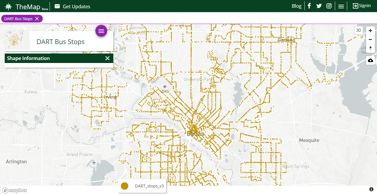
One of my favorite visualizations in TheMap is seeing where DART bus stops are. DART—which stands for Dallas Area Rapid Transit—seemingly has bus stops all over the city. A quick glance shows what can be estimated to over 100 bus stops.
This data set is surely important to Mundinger. After all, he’s concerned with increasing the access of public services to all residents of Dallas, including those below the poverty line. With TheMap, Dallas city officials can combine areas of poverty with bus stop locations. If there’s an area which is lacking of public transportation, DART could add a new bus stop there.
Combining Datasets in TheMap
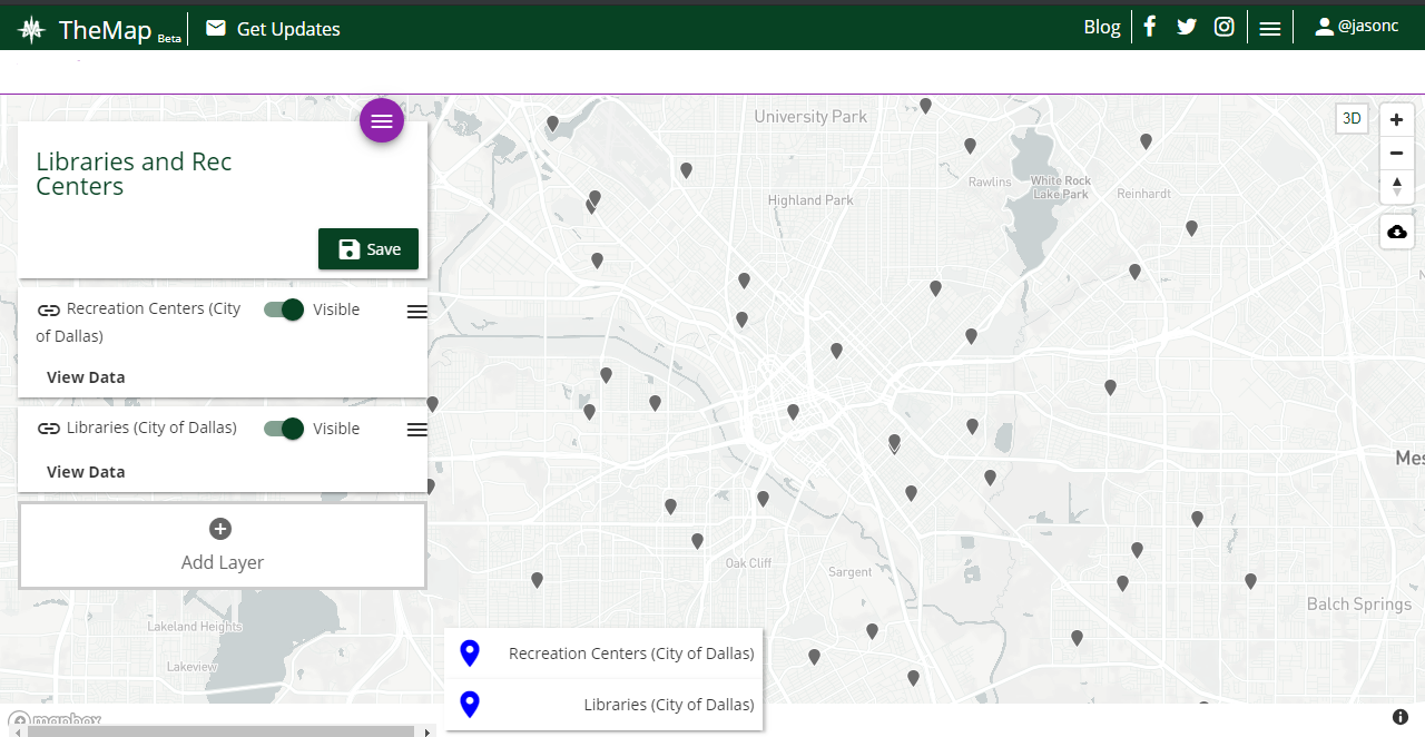
One of the most powerful and helpful features of TheMap is the ability to combine and layer multiple datasets. To do this, you’ll need to create an account which only takes a minute.
Let’s say I want to see the locations of libraries and recreation centers. People considering a move to Dallas may enjoy both of these placs and want to live near them. See the screenshot of TheMap to see how it looks when you combine data sets.
Notice that recreation centers and libraries are shown on the left side. In the screenshot, they’re both toggled as being “Visible” in TheMap. You can toggle either of them on or off to show their exact locations. Or, you can click on each pin to gain further information.
Final Thoughts on TheMap
Robert Mundinger has done a great, free public service to the city of Dallas. City officials should be using TheMap before they make decisions that will affect the residents of the city. For example, a new police station can be built near an area of high crime.
Dallas isn’t the only city that can benefit from using TheMap. Mundinger, or people inspired by him, can take this idea and apply it to virtually any city. It would all be in the name of improving the lives of residents over an extended period of time.
Featured photo by Aksonsat Uanthoeng on Pexels
TheMap photos are screenshots by RPS Relocation
Comments
Most Recent Blog Posts
 A Dallas Area Home Buyer Had to Pay $300,000 More Than Asking Price For Their New Home22 May, 2021
- Canada's Home Prices Have Risen 168.4% Since 2000, USA Home Prices Have Risen 54.99%01 Apr, 2021
- Home Prices in Seattle Are Skyrocketing12 Mar, 2021
- Seattle Among Best Cities for Startups08 Jul, 2019
- Renters in Chicago and New York are fleeing south for Dallas24 Jun, 2019